RF Hoodie Preview...
#1
 11-11-2009


RF Hoodie Preview...
So i finally got the hoodie but I am not really that impressed with it, I mean the hoodie itself is super nice the quality of the hoodie, size etc. I just dont like the front that well. We need to come up with a logo or some design and stick with it for a while...
Anyway pics
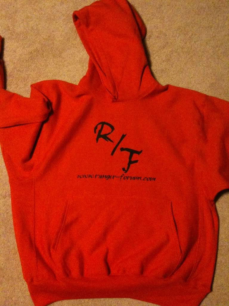
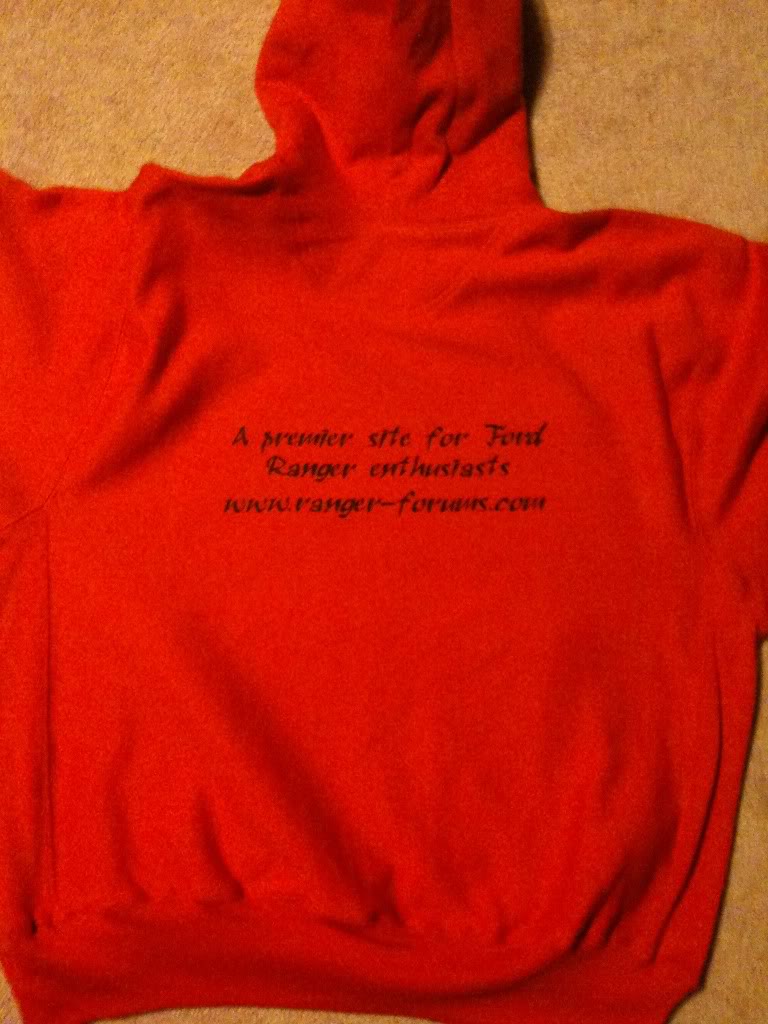
Anyway pics


#3
11-11-2009

I've said it before and I'll say it again.... RF 'new' logo. the oval one that was created a few years back would be perfect for the front. the back: the same stuff in the same font as the last batch of tshirts would be nice on the back.
#4
11-11-2009
Well, I hate to say it but I'm not digging either side. What happened to all those other designs Zach? Can we not use those? And if it would cost more for a more elaborate design, why not go with Hanes hoodies? Just a thought.....
#5
11-11-2009
Join Date: Sep 2008
Location: Lincoln, NE
Posts: 99
Likes: 0
Received 0 Likes
on
0 Posts
^ I like the front too... not the back... I'd almost rather have the back blank and keep the front lol


#9
11-11-2009
none of those other designs were any better IMO. Plus it is 20$ for each screen print.so this was an 80$ hoodie on the first run.
#13
11-11-2009
Then make it a front only screen. Clean and simple. RF oval logo, url below it. and call it good. That would be clean and simple and look good.
#14
11-11-2009
did you read? i said this is the base design, how about a positive suggestion so we can get something that looks good.
how about something positive, because i dont like it either, i want something that is nice, but none of the designs we have come up with so far are nice.
#15
11-11-2009
that is what i am leaning towards... idk the t shirts had something truck related on it, id love to get something like that but not the same... idk
#17
11-11-2009
Get rid of the corny premier site for ranger enthusiasts stuff and url on the back, and do just some kind of logo on the front. Plain text looks cheap and gay. If I knew how to do graphic design and stuff, Id make something, but I dont.
#18
11-11-2009
it is a one off print, it costs a lot to get that crap setup, takes a bunch of time too.
I am pretty sure I can get these nice quality hoodies shipped for 60 each. still pricey but I cant see getting a cheap one that shrinks after 1 wash.
I am pretty sure I can get these nice quality hoodies shipped for 60 each. still pricey but I cant see getting a cheap one that shrinks after 1 wash.
#19
11-11-2009
I hate the crap on the back. I'd just assume it was blank IMO.
#20
11-11-2009
You know how on the shirts u did the 01-03 front end? now how about the rear end of a 01-03 and in the oval put the R/F in it? (depending on price)
#21
11-11-2009
That's pretty lame.
Definitely gotta lose the writing on the back, looks uber cheap, and something better for the front.
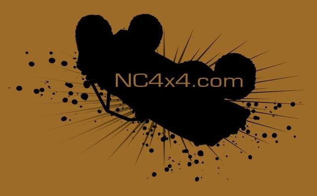
Maybe something like this, but with some kind of ranger silhouette.
Definitely gotta lose the writing on the back, looks uber cheap, and something better for the front.
Maybe something like this, but with some kind of ranger silhouette.
Last edited by seed60; 11-11-2009 at 12:29 PM.
#22
11-11-2009
Time to whip out the archives....zach, still got any of the first run and second run shirts from a few year back? If I recall correctly, it was the oval logo, URL at the bottom rounding that oval, and the "premiere site for ford ranger enthusiasts" rounding the top fo the oval. then some side racing stripes spaning for 6" or so which could be revised as tire treads.
Maybe make that oval logo and whats around it big, then the racing stripes for a couple inches.
Or....maybe do the grille idea, but larger and just the grille insert, with the same oval as described above with the surrouding lettering. Maybe this time using like a Gen4 grille or something.
Maybe make that oval logo and whats around it big, then the racing stripes for a couple inches.
Or....maybe do the grille idea, but larger and just the grille insert, with the same oval as described above with the surrouding lettering. Maybe this time using like a Gen4 grille or something.
Last edited by Fx4wannabe01; 11-11-2009 at 12:37 PM.
#25
11-11-2009
do i like it? yes, but we are more than a 4x4 site, we have members of all types on here. need something more basic.


